This is my revised second block for the Strawberry 2026 sew-along. I’ve been dragging my heels on this sew-along and let me explain why.
Do you ever start a project and feel that it “just isn’t you”? I love My Sew Quilty Life Heather Briggs’ designs, both her fabrics and her sew-along projects. However, I find that her relentlessly pastel palette is not always in line with my aesthetics. I started her Strawberry 2026 sew-along with excitement and a considerable investment in fabric. Once I made the first two months’ blocks, though, I wasn’t feeling the love.
So, I switched things up and made it my own. It involved some time with Jack the Ripper, and some re-sewing, but I am much happier with the results and think the finished quilt will be more in line with my tastes.
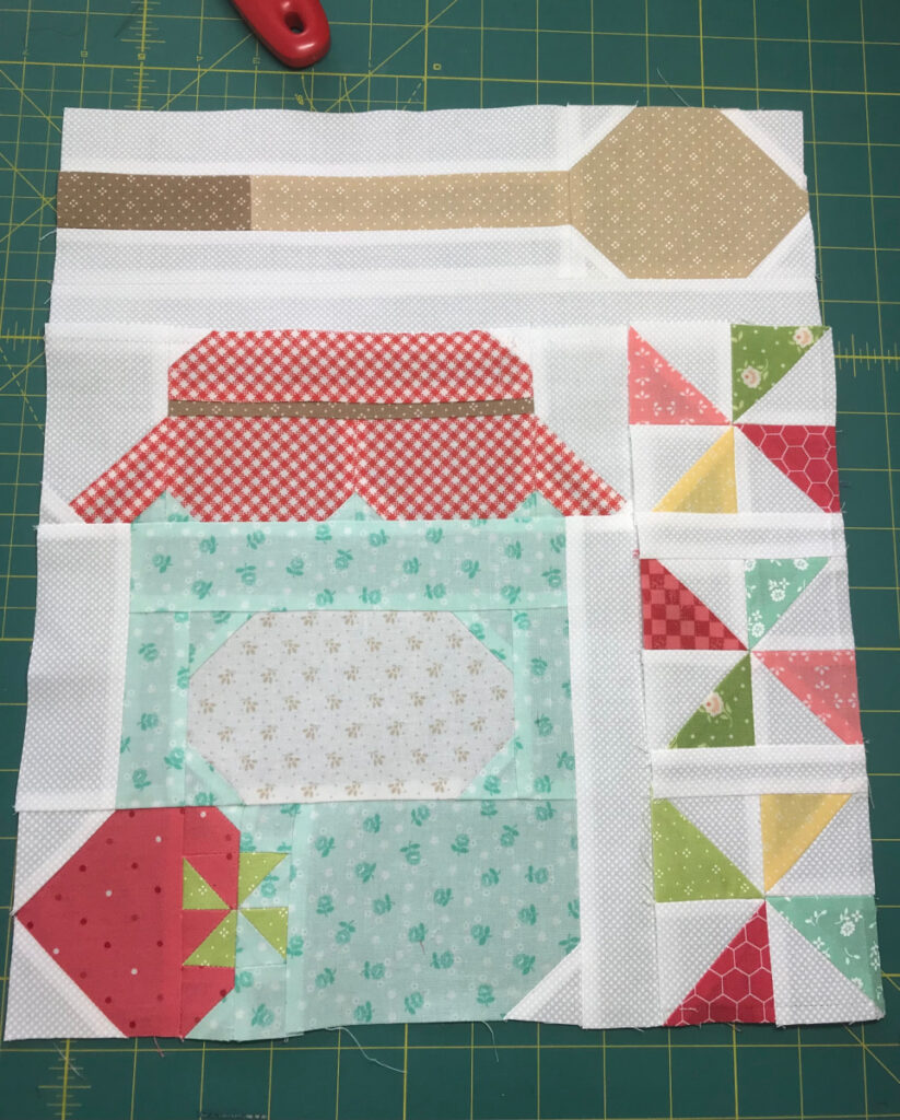
This was my first block. For those of you who love pastels, and aqua in particular, you may think this is the prettiest block you’ve ever seen. For me, though, the overall paleness of the colors borders on insipid. Perhaps bland is a better word. The change I made in the block at the top of this post makes me so much happier. I love some contrast in my blocks, and, to quote a former quilting teacher, “the addition of black into a quilt is never a mistake.” She said the same thing about using purple, but I draw the line there.
The fabric I used for the jar is not actually black, but a dark navy with a tiny pink berry. It is so dark it reads black in the block, making it stand out well next to the other colors. I am so much happier with the new version. What’s your opinion? Pastel or contrast?
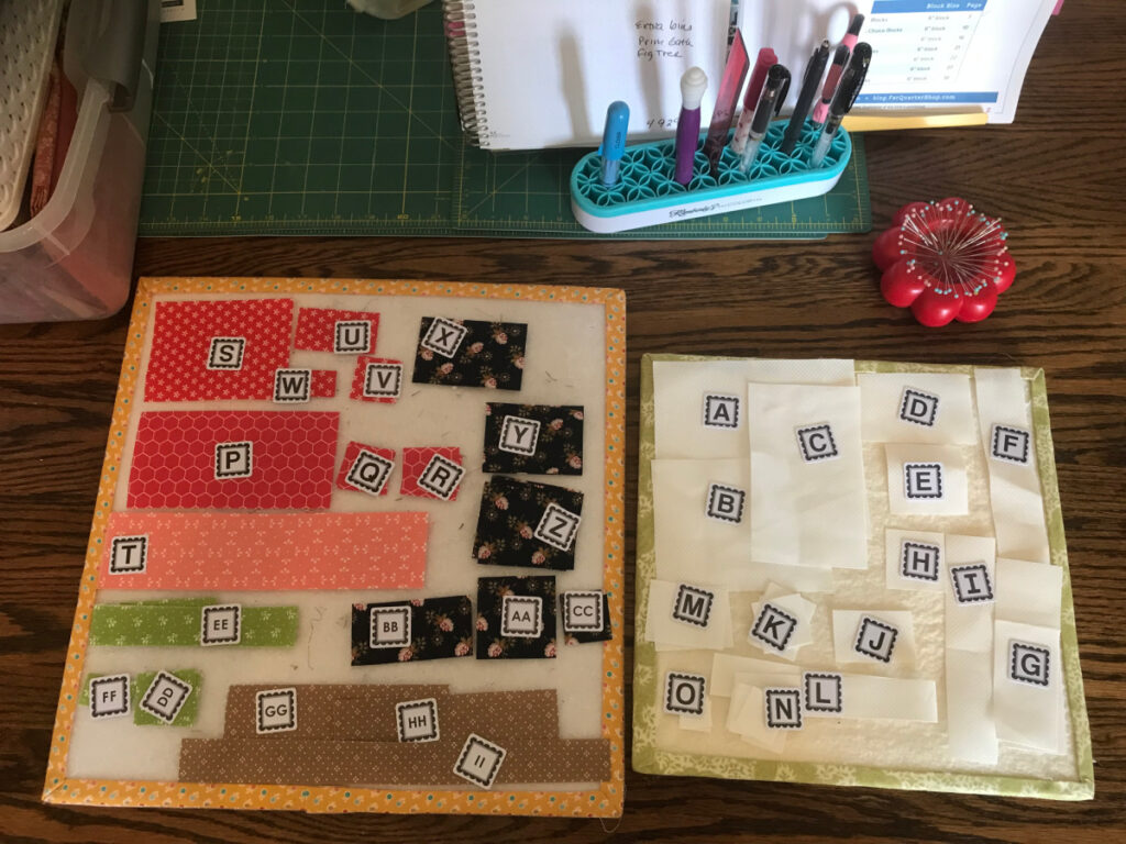
It took a while to redo the jar portion of the block. I had to completely re-make that section. I could still use the side pinwheel section and the upper spoon section, so that was good. These blocks are extremely labor-intensive, involving scads of pieces, some of them only 3/4″.
I let this project languish for a few months, after completing the January and February blocks, because, as I said, I just wasn’t loving it enough to spend so much time making blocks that didn’t “spark joy”. I have gotten my enthusiasm back, I think, and have all the pieces cut out for the third block.
Wish me luck! lol

10 Responses
Opportunity to put something fun on the jar label!
If the original pattern called for the aqua, designer might have been going for the look of an old glass jar. I agree, too pastel for me.
The jar reminds me of the quilts from decades ago where people got novelty fabric (green beans, blue berries, pickles) and made jar quilts.
Much prefer your dark jar – it looks more like a yummy jam! It’s more fun to delve in and make the project more to your liking though. I did laugh at Jack the Ripper – what a great name for it! I don’t think I’ve called it anything apart from perhaps a frog – rippit rippit! But Jack is brilliant!
Amazing difference. I thought you had changed more than one fabric. The dark blue/black makes all the colors pop. Love it!
I visited her website after you mentioned it and the pastels really were too much all in one blog. Your choice of the dark fabric is much better.
I’m definitely favoring the dark side! Love it! 😊 Definitely labor intensive with the tiny flip and sew corners.
Ooh, yes! The dark fabric makes it look like a jar of yummy jam (as Kerry already mentioned). What a great swap and a beautiful result. Very worth the extra time and effort 🙂
I agree with you. I do not like pastel fabrics, and while she has some great designs, I have stayed away from her pastel fabrics because they are not my cup of tea. I love the new colors in prints in the blocks that you remade.
if you aren’t feeling the love then time to do something about it. quilts need contrast.
What a difference changing one color can make! Maybe you could hand embroider ‘JAM’ on the label? That would up the cuteness factor! or not. Make it your own & you’re on your way!
I really like your changes, but I understand that there are many people who would prefer the original colors. Isn’t it great that we can choose what we want the colors and designs to look like in our projects? (Though there is a lot of security in going with the original design and colors). 😊