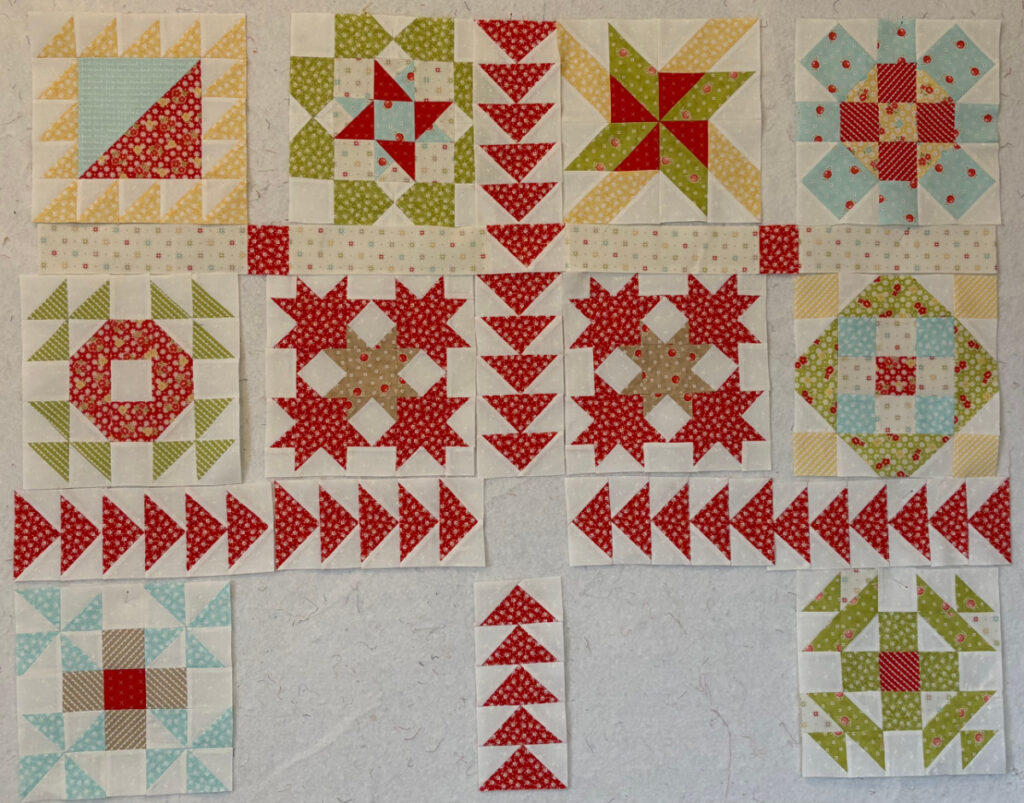
Much progress was made on my Bliss project yesterday. I have started putting together the blocks that form the center medallion and have arranged the flying geese setting strips so you can get an idea of what the top will look like when finished.
This is one of those projects where the setting is as much if not more fun than the blocks that make up the sampler quilt. I do love a quilt with a unique setting, and I think this one sets off the blocks nicely.
Vickie made a point in one of her comments recently about the importance of having a setting where the eye has places to rest. We had been discussing whether or not I would participate in the Sewcialites sew along this time, and she mentioned that the Sewcialites setting was somewhat chaotic (my words, not hers-she actually said “messy and muddy” lol) and that the eye did not know where to rest. Vickie’s comment caused me to remember a previous quilting instructor of mine who used that expression often, stressing how important it was for the observer’s eye to have a “resting place”.
In quilt design, a “resting place” is an area of visual calm that gives the viewer’s eye a break. It’s a space that isn’t busy with busy prints, sharp contrasts, or complex piecing. Instead, it acts like a pause between visual “sentences,” helping the overall design feel intentional rather than overwhelming.
This matters because our eyes naturally move across a quilt, noticing color changes, shapes, and patterns. If every inch competes for attention, the quilt can feel chaotic or tiring to look at. A resting place creates visual balance, guiding the eye smoothly around the quilt and making the design more comfortable and pleasing.
I think the reason this setting works is that the blocks are divided into quadrants by the flying geese borders, and the center medallion offers its own point of interest, separate from the blocks.
What do you think? Is this something you have thought about? Do you agree?


14 Responses
I think that particular quilt was needing resting places, yes. But if I remember correctly, it was more about placement of lights, mediums, darks. The design could not shine because of lack of definition. (Muddy was the right word.) Quilter would have benefited from a Ruby Beholder.
That setting is a total jumble for sure. The busy “setting squares” take away from the blocks themselves.
Yes, definitely. I made lots of scrappy 9 patch blocks, added them with neutral backgrounds to make larger 9 patch blocks. Then the small 9 patch blocks were put into a centre of Ohio stars with red points. The red stars in between the larger blocks made a nice resting place in the chained scrappy blocks. Need to quilt it!
Sometimes that block separation is just what is needed to make the blocks stand out.
Absolutely Nicole! Your eye need that place to ‘rest’. I think sometimes we as quilters try to cram too much into their quilts. Early on I had a quilt teacher say let the fabric do the talking and keep the pattern simple. I was in a beginner class and we were all trying to make our quilts ‘busy’.
I must say all your sewing efforts have been super inspirational lately!
Thank you Kerry! I appreciate you taking the time to comment.
The first thing that I noticed was that you’re keeping the aqua pinwheels! When laying out my blocks I often take photos then edit them to black & white. I find it helps with making sure that the blocks are placed evenly to give eyes those ‘resting places.’
I haven’t completely decided yet what to do about those aqua pinwheels. Someone commented that at the time I had only six or seven blocks, the aqua was a good addition. I think I have to wait and see what happens when I put all 12 blocks together.
Hope the aqua pinwheels hold their own with the other brighter colors.
I agree with quilts needing a resting place for the eyes and often admire quilt that are really busy but don’t make those.
Hugs!
this is really a fun quilt….I can’t wait to see the additions.
I’m making a rather complex quilt right now, and the designer has mentioned over and over to add “places for the eyes to rest”, This pattern really needs that, so I may be adding more neutrals than she calls for. I tend to think about adding solids or tone-on-tones to almost every quilt I make because I am not fond of the overly busy look.
I completely agree with you Sue!
I am working on a sampler quilt and I am going to tweak the arrangement for the same reason. Eyes need a direction or hint on where to start and end to take the whole thing. Harmony vs chaos, harmony makes it enjoyable to the viewer AND the sewer!
You are so right LIsa!