Hi there. Hope you all had a wonderful 3 day weekend, if where you live it actually WAS a 3 day weekend! Here in the US it was "Labor Day Weekend", an occasion that for a lot of folks signifies kids going back to school, days getting shorter, fall approaching, and summer's last fling-often celebrated with a backyard barbecue. The holiday itself is supposed to honor the working man/woman and their contributions to our country, with the reward of a 3 day holiday.
Ok, all that being said, for me the start of September and with it, Labor Day, is a time when I switch gears and want to launch myself full on into Fall, a glorious season. So, this week, I pulled out a cache of fabrics I have been hoarding and adding to for some time now. I have a pattern in mind, which I will reveal soon.
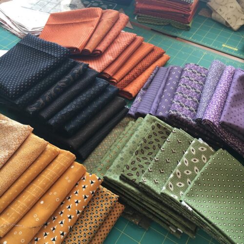
Let's take a look at these fabrics, shall we? So often I get comments from people saying "I really don't care for Civil War Reproduction fabrics, but I really like those", "I dislike Civil War Repros, but those are really pretty", "I am not at all a CW fan, but I love the fabrics you picked". Friends, it is all about your color palette, not so much a genre of fabric. Don't get trapped into a rigid mind set of thinking you abhor "modern" fabrics, reproduction prints, "brights", batiks, etc etc. It's all good. And believe me, you can achieve a very modern looking quilt using Civil War inspired prints.
What I like about Civil War Reproduction fabrics is that they are often small scale prints, which allows me to use them as pure color. Some people are under the impression that CW fabrics are dull or muted or boring. They can be, but there is also a wonderful selection of beautiful vibrant colors, as I show in the photo above.
The fabrics above are mostly designed by Julie Hendrickson (Sampler II for Windham) and Renee Nanneman (Pumpkin Spice for Andover). Both collections are still available at the Fatquartershop.com For my project I also pulled quite a lot of additional pieces from my stash. More is more, don't you know?
To my eye, this color palette says Fall and Halloween, just the colors I want to use in my next seasonal quilt project!

16 Responses
I love those fabrics! Luscious!
Beautiful selection! Can’t wait to see what you are up to Nicole!
Mary
I love those colors! And, I see plenty of dots…even better!
Oh, YUM!!! These fabrics look so delicious and I look forward to seeing what you have in mind, too.
aren’t tone-on-tone fabrics just the best?!
Hugs!
This is going to be so rich and wonderful, Nicole!! I had pumpkin spice in my shopping cart and then I never hit the complete order button. Now I’m having second thoughts after seeing your pic. Have a great day, Nicole.
Yummy colors!
Can’t wait to see what you’re cooking up with these fabrics! Love them!
The fabrics are wonderful, just my style!! Can’t wait to see what you are going to do.
gorgeous! i especially love the oranges. yep, i see halloween! ;p
Great colors and fabrics! It’s not that I don’t like CW fabrics but you can hardly find them here in Germany.
Gorgeous colors and the fabrics are great!
You are a true artist! You put colors together beautifully (is that a word?!) I can’t wait to see what you will make.
Gorgeous palette. I agree, you definitely have an eye for color. Perhaps, when and if you get a moment, you could do a “course” as to how you made your selection.
I. CAN’T. WAIT. to see what you make with these.
I had my CW phase a few years ago and bought up a ton of fabrics through eBay and of course FQS. One day… one day…
Totally yummy colors! I try to hold fall off until October as I’m not ready for summer to end:)
I personally love this palette of colours! Totally me.